The Power of Color: How Hospitals Use Apparel to Calm and Direct Patients
Strategically selected apparel colors in healthcare improve patient wayfinding and allow for instant role identification within complex clinical environments.
A hospital can be an intimidating landscape of sterile corridors, fluorescent lighting, and technical jargon. For a patient, navigating this environment is often a source of significant anxiety. While signage and floor markings are traditional tools for wayfinding, modern healthcare facilities are increasingly looking toward a "silent" navigational aid: the uniforms worn by their staff. By strategically selecting apparel colors, hospitals can create an intuitive environment that lowers stress, directs movement, and humanizes the clinical experience.
The Psychology of Clinical Palettes
The human brain is hardwired to respond to color long before it processes text or iconography. In a high-stress medical setting, the choice of apparel colors acts as a subconscious signal to the patient's nervous system. For decades, "surgical green" and "sky blue" have been the standard. This isn't just tradition; these colors exist at the opposite end of the spectrum from red, helping to neutralize the visual impact of blood and reduce "afterimage" eye fatigue for surgeons.
However, the modern hospital extends far beyond the operating room. We are now seeing a shift toward softer, more varied palettes. Soft blues and teals remain staples because of their association with trust and tranquility. In contrast, pediatric units might utilize brighter, warmer tones like soft yellows or lavenders to create a sense of approachability and playfulness. By moving away from a monochromatic environment, facilities can use color to signal the specific "vibe" of a department, helping patients feel more grounded in their surroundings.

Localized manufacturing ensures color consistency across hospital uniforms, reinforcing brand identity and supporting a calm, professional atmosphere for patients.
Navigational Intuition and Wayfinding
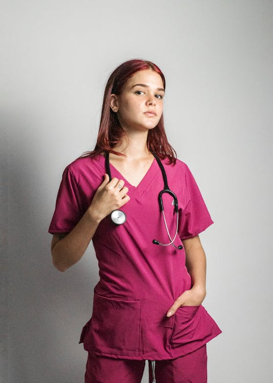
One of the most effective uses of color is "role-based identification." In a crisis or even a standard recovery room, a patient should be able to identify who is a nurse, who is a doctor, and who is a member of the support staff without having to squint at a tiny ID badge. Color-coding hospital scrub suits in Austin allows for instant recognition.
When a facility implements a strict color hierarchy—for example, navy for RNs, pewter for technicians, and wine for respiratory therapists—the cognitive load on the patient is reduced. They no longer have to wonder who is entering their room. This clarity fosters a sense of security and control. Furthermore, this system assists with physical wayfinding. If a patient knows that the "burgundy team" belongs to the oncology wing, they can follow that visual cue as they move through common areas, making the facility feel less like a maze and more like a structured, organized system.
Boosting Staff Morale and Unity
While the patient is the primary focus, the impact of color on the staff is equally significant. A well-designed uniform program creates a sense of "unit pride." When staff members wear high-quality custom hospital scrub suits in Austin, they feel like part of a cohesive team. This visual unity can break down silos between different departments and foster a collaborative atmosphere.
Moreover, the physical design and silhouette of the garment must match the professionalism of the color. A custom-dyed garment that is poorly tailored can look unprofessional, regardless of its color. This is why many facilities are looking toward localized manufacturing to ensure that the fit, finish, and hue are consistent across the entire workforce. Professionalism is a cumulative effect of how a garment looks, feels, and performs under the pressure of a 12-hour shift.

The implementation of department-specific apparel colors reduces patient anxiety by providing clear visual cues for staff recognition and facility navigation.
The Technical Side of Color Consistency
For a large-scale hospital system, the biggest challenge isn't choosing a color—it’s maintaining it. "Color drift" is a common issue with mass-produced, offshore apparel. A navy top from one batch might not match the navy pants from another, which erodes the professional image the facility is trying to build. This is where the value of domestic production becomes undeniable.
When healthcare systems choose custom medical apparel in Austin, manufactured by Stitch Texas, they gain a level of oversight that is impossible with global vendors. We ensure that dye-lots are consistent and that the technical properties of the fabric—such as fluid resistance and antimicrobial finishes—do not compromise the vibrancy of the color. Localized production allows for rigorous quality control, ensuring that the "healing green" or "trusted navy" your brand selected looks identical on every floor of the hospital.
Humanizing the Healthcare Experience
Ultimately, the goal of a sophisticated color strategy is to humanize the healthcare experience. By using color to direct, calm, and identify, hospitals are speaking a universal language that transcends barriers. It makes the environment more navigable for those who may be disoriented or in pain. It provides a clear roadmap for families and a sense of professional identity for the clinicians who keep the facility running.

Consistent color palettes in medical uniforms foster team unity and professional identity while contributing to a more intuitive and less intimidating patient environment.
Let’s Refine Your Facility’s Visual Identity
At Stitch Texas, we know that your apparel is the most visible representation of your brand's commitment to care. We don't just provide "off-the-shelf" solutions; we act as a strategic partner to help you develop a uniform program that is as technically advanced as it is visually cohesive. From choosing the perfect, evidence-based palette to ensuring a precise fit for every member of your team, we handle the details that make a difference in patient satisfaction. If you are ready to move away from generic workwear and toward a high-performance, color-coded apparel strategy, our team is here to lead the way. Reach out to us to discuss how we can bring precision, consistency, and a human touch to your facility’s wardrobes.